PROJET : Global branding
DATE : July 2019
Since 1828, year of the foundation of the Maison Planat & Co., the griffon is present, impassible. Time had no impact on its posture.
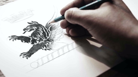
We are lucky to feed our reflexions with archives helping us to recount the graphic elements used during age. The griffon and the star it held initially - you will encounter on packaging - inspired us to rejuvenate the branding still with humility, and give the modernity touch link to our present.
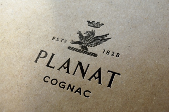
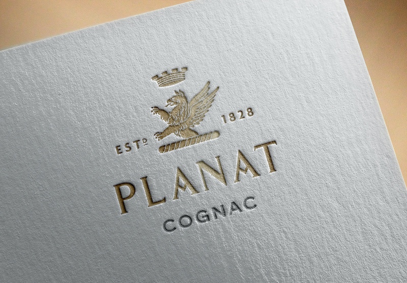
Thus, the griffon has been redrawn to be used in plain and not in line. The brand has started a new chapter of its life since Nau & Soerlie families are the owners. Planat & Co. has sturdy foundation worthing a griffon hallmark as a strength and requirement icon.


The old version of the griffon is still active as an illustration and comes to light some communication tools like the business cards or powerpoint presentation.
The specific red color has been defined for institutional elements of the brand but also in touch on organic packaging.
A graphic charte and a brand book has been set up to guide all the vitality and creativity attached to the Cognac Planat.


As Art Director, we also have created the packagings and website.
